
파이썬/통계전산처리
통계전산처리 - 7주차 (다양한 시각화)
kimmalgu
2024. 9. 5. 20:08
import pandas as pd
import numpy as np
import seaborn as sns
from matplotlib import pyplot as plt

activities=['eat','sleep','work','play']

slices=[3,7,8,6]

colors=['r','y','g','b']

plt.pie(slices,labels=activities, colors=colors,
       startangle=90, shadow=True, explode=(0,0,0.1,0), radius=1.2,
       autopct='%1.1f%%')
plt.legend()
plt.show()
color='cornflowerblue'
points=np.ones(5)
text_style=dict(horizontalalignment='right',
               verticalalignment='center',
               fontsize=12, fontdict={'family':'monospace'})

def format_axes(ax) :
    ax.margins(0.2)
    ax.set_axis_off()

fig,ax=plt.subplots()
linestyles=['-','--','-.',':']
for y, linestyle in enumerate(linestyles):
    ax.text(-0.1, y, repr(linestyle), **text_style)
    ax.plot(y*points,linestyle=linestyle, color=color,
           linewidth=3)
    format_axes(ax)

    ax.set_title('line styles')
plt.show()
def f(t):
    return np.exp(-t) * np.cos(2*np.pi*t)
def g(t) :
    return np.sin(np.pi*t)
t1=np.arange(0.0,5.0,0.01)
t2=np.arange(0.0,5.0,0.01)
plt.plot(t1,f(t1),t2,g(t2)) #기본
plt.plot(t1,f(t1),'g-',t2,g(t2),'r--') # color, line
plt.show()
def f(t):
    return np.exp(-t) * np.cos(2*np.pi*t)
def g(t) :
    return np.sin(np.pi*t)
t1=np.arange(0.0,5.0,0.01)
t2=np.arange(0.0,5.0,0.01)
plt.subplot(221)
plt.plot(t1,f(t1))
plt.subplot(222)
plt.plot(t2,g(t2))
plt.subplot(223)
plt.plot(t1,f(t1),'r-')
plt.subplot(224)
plt.plot(t2,g(t2),'r-')
plt.show()
3.3 다차원 데이터에 대한 다양한 표현
iris=sns.load_dataset('iris')
print(iris.head(n=2))
print(iris.groupby('species').mean())
sns.pairplot(iris,hue='species')
sns.jointplot(x='sepal_length',y='sepal_width',data=iris,
             color='brown')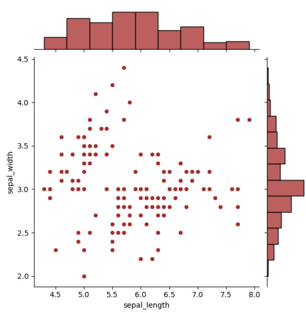
sns.jointplot(x='sepal_length',y='sepal_width',data=iris, kind='kde')
plt.suptitle('Jointplot&KernelDensityplot',y=1)
plt.show()
pg=sns.PairGrid(iris) #사용자가 설정한 버전
pg.map_upper(sns.regplot)
pg.map_lower(sns.kdeplot)
pg.map_diag(sns.distplot)
# 모자이크 plot
from statsmodels.graphics.mosaicplot import mosaic
airplane={('survive','male'):50,('survive','female'):30,
         ('death','male'):50,('death','female'):70}
mosaic(airplane,title='mosaic plot')
plt.show()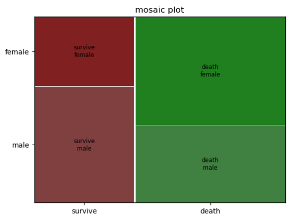
3.4 3차원 그래프
# GPT 코드
import matplotlib.pyplot as plt
from mpl_toolkits.mplot3d import Axes3D
import numpy as np

fig = plt.figure(figsize=(10, 10))
ax = fig.add_axes([0.1, 0.1, 0.8, 0.8], projection='3d') # Adding axes using add_axes with proper position and projection

x1 = np.arange(-3, 4, 0.1)
x2 = np.arange(-4, 5, 0.1)
x1, x2 = np.meshgrid(x1, x2)
y = (x1 ** 2 + x2 ** 2 + x1 * x2)

ax.plot_surface(x1, x2, y, rstride=1, cstride=1, cmap=plt.cm.hot)
ax.contourf(x1, x2, y, zdir='z', offset=-2, cmap=plt.cm.hot)
ax.set_zlim(-2, 50)
plt.show()